Wednesday, 27 February 2013

Evaluation

I am sad to come to the end of this project as I have really enjoyed this one. This project has played to my strengths and has let me run at full creativity. 
I am extremely pleased with the concept I came up with as I can not see that it has been done anywhere else and I feel that it is exactly the step above the competition the company has asked for. 
My target audience is the parents and relatives that have young children around the age of one and those who have children with learning disabilities. Based on the UK average pregnancy age being at 29, this puts the average target audience for my cards at around the age of 30/31 which sits nicely in the allocated 16-34 giving room for siblings of the parents to also be included in the target audience barrier. 

I am very pleased with how my card designs have come out and there is very little that I would change about them. I have left the message area inside blank so that people can wring their own personalised messages which in my research was a big selling point. The designs are fun and interesting and have left large enough sections for the textures to be felt in and they have all be built around the recommended 3mm bleed. Here are my finished designs for both front and back covers and inside the cards.


I have also made one of my cards physicslly to show how the textures will work and the size of the card, I couldn't be happier with how well it has come out. Here is a photograph of my finished card.


Tuesday, 26 February 2013

PDF Design

For this project we have also been asked to create a PDF explaining our product. This PDF should include our concept, font choices, card sizes, designs, envelope designs and im my case materials used. We need to make sure that any work that has been used from elsewhere is credited at the end and above all the PDF should be well presented. 

Following this I decided to write up all of my content under the following subtitles:


  • concept
  • target audience
  • size
  • font choice
  • branding name and logo
  • textures
  • front of cards
  • card designs
  • envelope
  • credits
  • my details

I then needed to come up with a nice design for the pages of my PDF, I wanted the design to be simple but also relevent, so I decided that having the background of mainly green with my sheep, fence and sky at the top would give it enough to have a good appearnce without being distracting. This design also gave me a very good size for all of my text and images.

Here you can see some examples of my page layouts, my PDF is 15 pages long all together.


Monday, 25 February 2013

Crit Feedback

Today I presented my work to the class for last minute feedback before deadline on Wednesday, the feedback I received was extremely positive and the changes suggested are very reasonable in the time I have left. 

The main things that came up were that there needs to be a clear sections where the sender can write and that no characters should be in the centre fold of the card.

To over come these problems I have added a white boxed out section in each card that will be left matt so it can be written on and I have made a table to show exactly where the centre fold and the 3mm bleed sections are on the cards to make sure that all my characters stay in tact.

Friday, 22 February 2013

Envelope design

Now that I am happy that my cards are coming together, I have decided to focus on my envelope design. Because my cards are quite thick I have decided that they would suit being boxed rather than put in a paper envelope, however nothing beats the excitement of getting a letter through the post around your birthday, so I have decided to keep the appearance of the letter and put this on my box design.
The box will need to be thin light weight cardboard that will keep its shape and protect the card but will not add to the postage price. 
The box will need to be fitted snug to the card so that it gives maximum protection and does not let the card bash the sides, however it can not be tight as the card will need to be inserted and removed with ease. To make this process easier I have decided to make sure the box opens on both the left and right hand side so that there will be no issues of the card getting stuck.
Here are the front and back designs for what I would like the box to look like.


Monday, 18 February 2013

Mock up

This is my mock up for my underwater themed card with both the front cover and the inside image. 

The textures that I have suggested using for this card are, 

  • Rough
  • Fluffy
  • Smooth
  • Squishy
  • Bumpy


These textures will be on the turtle's shell, the fish's stripes, the crabs belly, the white shell and the octopus' belly.


Friday, 15 February 2013

Brand Name and Logo

When coming up with my brand name and logo I wanted it to suit my card range, to do this I started looking at the textures in my cards as the feeling element is what makes my cards unique. I found that my most used textures were squishy, smooth, shiny and fuzzy. I then started to think about how these could be changed into a fun, east to remember brand names. I decided that of all the names "Fuzziez" works best with my cards.
To create the logo I started looking for fonts associated with the word the word "fuzzy" and I came across a font called "Fuzzy Font" by font soup (http://www.fontsoup.com/) which is a font made to look like it has been cut out of felt. 


I thought this is the perfect simple logo style that fits very well with the selling point of my cards. 
To make it look a little less structured and tidy I made some of the letters bigger and smaller than each other and made sure they didn't all sit exactly on the same line, this makes them look a lot more like they have been cut out and placed down on a table rather than looking like a font face. The final thing I did was to draw a cloud shape in white for the logo to sit on as i wanted to make sure that it would stand out against any background colour. Here is my finished logo design.


Wednesday, 13 February 2013

Mock up

This is my mock up for my space themed card with both the front cover and the inside image. 

The textures that I have suggested using for this card are, 

  • Fuzzy
  • Fluffy
  • Smooth
  • Squishy
  • Rough 
  • Shiny


These textures will be on the purple alien's spots, the UFO's flame, the green alien's lower body, the robots buttons, the space dog's spot and the astronaut's helmet. 


Saturday, 9 February 2013

Mock up

This is my mock up for my farmyard themed card with both the front cover and the inside image.

The textures that I have suggested using for this card are,

  • Fuzzy
  • Fluffy
  • Smooth
  • Squishy
  • Soft


These textures will be on the chicken's wing, the cow's spots, the pony's mane, the pig's nose and the sheep's body.


Thursday, 7 February 2013

Mock up

Here is the improved mock up for my Jungle themed card, this also now includes a front cover design. 

The textures that I have suggested using for this card are, 


  • Fuzzy
  • Fluffy
  • Smooth
  • Squishy

These textures will be on the monkey's belly, the giraffe's spots, the lions mane (inside and on front cover) and also on the zebra's stripes.


Wednesday, 6 February 2013

Pitch Feedback

After showing the class my work I am even more confident that this project is going well. I only received good feedback and have been told to continue on as normal. 
I have decided that it would be better to follow the path of farmyard, space and underwater rather than my originally thought out princess, pirate and teddy bear picnic. 
I have changed my mine about my themes as I feel the new ones will fit the style from the original card design better and they are much more uni sex, there is no need to do girl and boy cards separately as it limits the audience for each card. For this reason I am going to make sure my cards are all suitable for both sexes. 

Friday, 1 February 2013

Jungle Mock Up

Now that I have looked into texture and structure, I am taking my jungle themed image and turning it into a sample to show the class how my structure comes together to create a picture. 
Here is my jungle design that I have drawn up using Illustrator. 


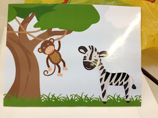
From this I then made a smaller image to test my structure for my sample, I then printed this onto matt photo paper and covered it in sticky back plastic, I then cut out the sections I wanted to be textured such as the zebra's stripes and the belly on the monkey, I then stuck the filler material onto the base card and stuck my image over the top.  I am extremely pleased with how this has come out and it has really motivated me to create the other designs for the range of cards. 

Here are the two samples, one of which has had text added with my mirror material behind it to make it very shiny.