Saturday 26 January 2013

Card Structure

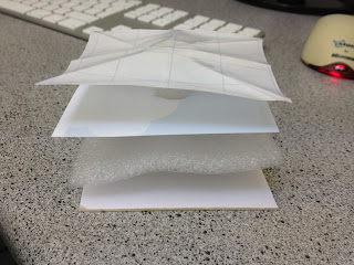
The structure of these cards has been a large part of the design process, I have been looking at how touchy feely books are layered and bound to give me an idea of how I will need to structure mine.   


This is a structural sculpture of how my cards are going to be built up, here you can see that at the base of the card, is a thick piece of card which provides the stable shape and the durability needed to stop the cards bending or tearing. Above this is the texture layer, this is the section where all of my different textures and materials will be, above this there is the photo layer, this will hold my design, the sections that will be textured will be cut out of this layer so you can feel through but not reach the edge of the material underneath to prevent the card being pulled apart. The top and final layer in this build is the sticky back plastic, this gives my card a protective layer which also provides the wipeable surface, the sections that are textured will also be cut out from this layer so you can feel through past it. 

This structure gives my card the strength and finish it will need.

The next thing I experimented with is the way the spine of the card will work, what I have done is stick a slightly longer than the length of the card layer over the back of the card while it was folded, this gave me the chance to fold this around the depth of the card, effectively creating a spine like a book. this was then stuck down but not all the way to the edge so that when the card is opened the backing can move away from the card letting it open and close with ease. Here is my sample spine card.


Now that I am happy with the structure and spine of the cards I can continue to develop my designs. I have decided that to give myself the best possible area for my scene inside the cards I will make my cards 7in x 7in making them 7in x 14in when opened, this also keeps me in the large letter size which will keep the cost of postage down. This size is perfect for my cards as I do not want them to be too big for the child receiving them to play with. 

Thursday 24 January 2013

Textures

Te next step in my project is to have a look at some textures to give me an idea of which materials accompany words such as bumpy and fuzzy. Here is the moodboard I created using different words and materials. 


Sunday 20 January 2013

Postage

An important part of the card industry is posting. Here I have got a chart of postage sizes, prices and weights.

So here you can see here the depth of a standard letter is very small and will not be deep enough for the layers I will be using in my cards. For this reason I will need my cards to be a large letter which means that I can use up to 353mm x 250mm in width and height. This gives me more room for my designs than originally thought which is a bonus. 

Child safe

After looking at children's books that have the same style as the cards I am planning on designing, I have seen a few things that I will need to take into consideration to make sure the cards are suitable to give to young children I will also need to take a few fundamental rules of card design, these together have given we a list of must be's: 

  • Durable- these cards will be given to children  meaning there is a high chance that they will be pulled, pushed and chewed. These cards will need to be able to stay together to prevent any harm to the child.
  • Wipeable- These cards might end up will dribble, food or much worse on them, for this reason they will need to have a wipeable surface so that they can stay clean.
  • No sharp or pointed corners- As these cards will go to children, they need to be safe and not cause any harm to the child if left unsupervised.
  • No tearable or easily perishable materials- No materials that can be pulled off or apart should be used as they can become a choking hazard to the child.
  • Writable- Being a card there needs to be a section to write in, there would be no point in sending it otherwise
  • Light weight- This is to keep postage price down and also so that if dropped the child will not be hurt by the weight of the cards.
  • Interesting- The point of the cards  is to stimulate the child, for this reason they need to have an interesting pattern and textures inside, the card also needs to appeal to the buyer so appearance is everything.

Wednesday 16 January 2013

Class Feedback

After showing the class my three ideas we decided that the child safe touchy feely cards were the best of the three as they are original and leave room for the most creativity. 
The next steps in this project will be looking into what makes a card child safe, what size the cards will be and what types of materials can be used. 

Monday 14 January 2013

Initial Ideas

I have come up with three main ideas to pitch to the class, here are the three ideas that I have drawn quick digital sketches of.

My first idea is to have a flap up card, this would be like the old children's books with the lift up flaps that reveal sections that are otherwise hidden, this could be combined with the idea of hide and seek so you have to find the pirates treasure or find all the party quests in the card. This would mainly be given to 5 year olds, and as the UK average pregnancy age is 29, this means that the parents of the 5 year olds would be around 34 which is the top end of my given target audience for the buyer, however this card could also be spent by family and friends that could fall in my target audience of 16-34. 
Here is a quick digital sketch of what this idea could look like.


My next idea is to have a pop out of the ox card. This idea would have a small box with a spring inside that is attached to a note from the sender, the idea is that when the box is opened the note will spring out like a jack in the box. This card is a fun idea which will make the recipient laugh and will make the card very memorable. The only problem with this idea is that sending a box instead of a card is going to be more money and the recipient might have to pick it up from the post office is they are out when it arrives. However here is an example of what this idea could look like.


My final idea is to have touchy feely cards, these were inspired by the printed textures on some of the cards that I analysed earlier. On these cards they had strong textures that were printed on to make the cards look more 3d and interesting. I then decided that it would be a good idea to explore this further with using actual textures. This then lead me to think about the "that's not my" book series which is very popular with young children aged around 1. These books have bright pictures and lots of textures to entertain and stimulate children. After looking around I have found that there are no other cards that currently do this to the extreme that they would be able to be doubled up as a you. For this reason I have drawn up a baby safe touchy feely card.


Sunday 13 January 2013

Existing Cards

After having chosen my brief, I decided to have a look at the sort of cards that are already out there to try and work out what sells and what hasn't been done yet. here are some cards that I found and have analysed.


This is a birthday card by a company called Cinnamon Aitch (http://www.cinnamonaitch.co.uk/) this company has a lot of their cards in paperchase. This card as you can see is very clearly targeted at women as they are the main buyers of cards. This card used more than one layer to keep the card interesting, it uses things such as buttons and googley eyes. This card also has some fake textures on it such as printed knit pattern and a wooden pattern to give the look of real textures. This card has a very cute easy which is making it very appealing. The idea of having a textured look with 3d elements such as buttons is a big selling point and is something that I will consider when creating my cards.


This is another birthday card this time from Hallmark (http://www.hallmark.co.uk/) and this one is targeting a male recipient, and in this can someone's husband. As you ca see this card is very simple and clean as most male targeted cards are however it still appeals to the female audience as they are the ones most likely to be buying the card. There are big differences in male and female cards mainly being that male cards tend to be simple with no 3d trinkets and add ons. This is something to note when designing my card range.


Companies such as funkypigeon.com (http://www.funkypigeon.com/) are becoming popular with their highly personalised cards, and gifts to follow. Unfortunately making card to sell in a shop easily personalised is very tricky but is definitely something to keep in mind when I create my own range.

Thursday 10 January 2013

Card Stats

To find out more about the card business, I looked into the sales statistics for 2012 and found that the industry for greetings cards, even though it has decreased slightly, is still at a huge 952 million cards sent per year. That averages at 31 cards sent per person per year. 

Here are some more interesting facts that I found:


  • Nearly 1.38 billion pounds were spent in the uk on greetings cards
  • The average retail price (ARP) of a card is now £1.44, up from £1.39.
  • Mother’s Day remains the largest Spring Seasons card sending event, showing a rise to £57.2m in 2011 from £56.4m in 2010
  • And the UK public continues to show its romantic side with Valentine's Day sales also increasing to £41.5m in 2011, up from £40.7m in 2010
  • The UK card industry is acknowledged to be ten years ahead of the rest of the world in terms of design.
  • Greeting cards are stocked in more types of outlet than any other product – with one in six retailers stocking greeting cards


All found at:
http://www.greetingcardassociation.org.uk/info-resource/market-info/facts-and-figures

Chosen Brief

After having looked closer at the brief and then having a clas brainstorm about what types of cards are possible I have decided to go with the card making brief. I enjoy using Illustrator and Photoshop and I feel that these skills are best suited for this brief. I also think that I will be able to explore this brief further than the one for baccardi as it is a lot more open and creative.
My next step is to look into some card statistics and have a look at existing cards by this company to get a feel for their branding. 

Wednesday 9 January 2013

Class Brainstorm

In todays lesson we looked closer at the briefs we had shortlisted and tried to make a decision on which one we are most likely going to peruse  We then got the class together to start generating ideas for a few of the briefs from the YCN's website. One of the ones that was most successful was the UK Greetings cards, which is the one that I feel I am most likely going to take forward in this project.
Here are some of the ideas that we came up with as a class, and although some seem a little bizar and impossible to make, they are all worth noting down as an aspect of concept of one of them might spark an idea.
Using the phrase "stand out from the competition" there are the ideas and suggestions that were made.

Video card
Snow globe card
recycled or recyclable card
Magnetic front card
Fridge magnet card
White or black board front card
Edible card
Scratch and sniff card
Touch and texture card
First holy communism card made of bread
Squirts you in the face card
18th birthday with sick bag inside
Knit or sew your own card
3D card
Puzzle front card
Card with games inside
Light up card
Glow in the dark card

Tuesday 8 January 2013

Competition Brief

Although we have not been given our full brief yet, we have been told as much as we need to get started on the project. This new project involves the competition put on by the YCN. Each year they put on a competition made up of several different briefs. This year there are 21 companies that have set briefs, some having written more than one. This means that there is a huge variety of choice but does also mean that I will need to go through them all making sure I pick one that is going to give me the best chance of using my skills.
We went through and skimmed the requirements of each brief and marked them out of ten, this was to give ourselves an indication of which ones we need to read in full and start thinking of ideas for. 
These are the marks I gave the briefs in relation to how interesting and inspiring I found them to be.


After doing this I looked at my top four briefs in full (Bacardi, Douwe Egberts, Ugg and UK Greetings). From these four I then marked it down the the two I thought I could do the most with, and have taken notes on the two briefs below.

Bacardi
Bacardi are asking us to make themselves appeal more the men, introduce their history to show that Bacardi is not a cheaply made drink. To do this they have suggested new glass wear  augmented reality coasters and possibly a new cocktail with a masculine campaign. The whole idea of the campaign is to get guys drinking Bacardi. 
The target audience for this brief are males aged around 21, they need to be old enough to drink but young enough to be influential on others in the bar. 
The campaign will not be strictly held to bars or clubs, so shouldn't be tied down to this, it will also be shown across different platforms which should be taken into consideration. Because of the nature of the product there are strict advertising standards that must be met throughout the whole campaign.

UK Greetings
UK Greetings are asking for us to create at least four cards and a sub brand name and logo. The cards must include a front cover design, textures and feels, colour choices on both card and envelope, font type and size for inside and outside of card. The size and shape of the card should also be considered. 
They have stated that the target audience is around 16-34 and can be for any occasion, they have said that it is mainly women who buy cards and although the cards need to appeal to the recipient, it is the sender who is buying the card and it needs to appeal to them as well. 
The main point of them doing this is to make sure that their company keeps giving new designs and ideas to make sure that they stay ahead of the competition, to do this our designs need to be unique and edgy.