Saturday, 6 April 2013
Change of heart
After reflecting on my attempt to film my ident and speaking to the class about the look and feel, we all decided that to get the red and white contrasting enough and to get the colours exactly right it will be much better to animate the whole ident. This can be done for all of the ideas that I have had, so I will not revisit some of my ideas and see which I feel will work the best as an animated ident.
Thursday, 4 April 2013
Pitch Feedback
Now that I have pitched my ideas to the class, I feel like I have a few things to think over. Everyone liked the idea about having strong branding and making the channel colours the main focus however they felt the video that I showed didnt work as well as it could have. We spoke about the changes I am planning on making to the video but they suggested to go with one of my other ideas as it looked a little like a ladies "time of the month" which is not what I was aiming for at all!
The other thing that was bought us is that I have come up with a lot of ideas but I will not have time to do them all, my tutor asked me the question "how many of these are you actually going to have time for" and I was stumped, this is something that I actually hadnt thought about and now I am looking at it, I will only have time to make a complete package for a couple of them. So going on from this I asked which ones were the favourites and I have narrowed it down to four that I will continue to sketch up and work out from there which ones are best to develop. The four I haver narrowed it down to are the washing machine, the tattoo, the jelly and the lava lamp.
The other thing that was bought us is that I have come up with a lot of ideas but I will not have time to do them all, my tutor asked me the question "how many of these are you actually going to have time for" and I was stumped, this is something that I actually hadnt thought about and now I am looking at it, I will only have time to make a complete package for a couple of them. So going on from this I asked which ones were the favourites and I have narrowed it down to four that I will continue to sketch up and work out from there which ones are best to develop. The four I haver narrowed it down to are the washing machine, the tattoo, the jelly and the lava lamp.
Wednesday, 27 March 2013
Filming
After some sketching and planning in my book, I decided to go ahead with my ice lolly melting to reveal the Latest TV logo on the stick idea. This is a very simple idea where there is a bright red ice lolly which melts over time (and is later sped up) to leave just a red puddle and a stick which has the logo etched on. The backgrounds will all be white making the colours specific to the show.
To start filming this ident, I first set up a space where I could melt the lolly overtime without the light effecting the shot with shadows and dipping brightness. I set up a box with a waterproof white lining that could have lights shining down onto it with the camera above the lolly. I then left this to melt overtime although I did encounter a few problems along the way, the problems I had were:
To start filming this ident, I first set up a space where I could melt the lolly overtime without the light effecting the shot with shadows and dipping brightness. I set up a box with a waterproof white lining that could have lights shining down onto it with the camera above the lolly. I then left this to melt overtime although I did encounter a few problems along the way, the problems I had were:
- Lolly took a long time to melt
- Camera did not have enough space to store full video in one shot
- Due to camera movement there are a few jerks in the footage
- The lolly melted and ran off in one direction rather than the puddle I expected
However I have come up with some solutions for the next time I film this. What I have planned is to warm up a plate and put this under the waterproof lining so that it encourages the ice lolly to melt quicker and will also hold the liquid in a puddle rather than running off camera like last time. Increasing the speed of the melt will also sort the issue of not having enough memory on my camera and without having to move the camera to delete other videos to make space there should be no need for the camera ro be moved and therefore it will be smooth untouched footage.
Here is the movie that I have now edited to be much quicker and I have also edited on the text for the lolly stick.
Monday, 18 March 2013
Ident ideas
After looking at some idents on other similar channels, I found that they ones that worked most effectively were the ones that made you think of the channel straight away, with style and colours instantly making the link to the channel branding.
Here is an ident from E4, in this ident you can see that their colour choice has made the instant link back to the cannel branding.
I have decided that this is such an effective way of branding a channel that I am going to go down this path for Latest TV. Their current branding which they would like to keep is a bright red, white and Verdana font.
To keep this strong theme I will make my idents almost completely red and white so as soon as they come on it will make people think of Latest TV and the logo will be created using a Verdana font.
In my book I have started to create a brainstorm of all things that are red and could be featured in my idents.
Wednesday, 13 March 2013
Brief- Latest TV
For this project we are working with live clients, we have been asked to create some ident packages and some programme packages for Latest TV. Latest TV is a show that has previously been online but has now ventured out to free view and have got the rights to channel 8 around brighton but it may stretch as far as eastbourne, their channel will be launched in January but they currently don't have any graphics, idents, lower thirds and stings.
The first half of this project will be creating an ident package to brand the show. This will include idents which are 10 seconds long that can feature a voice over and a 3-5 second ident that can be played on its own in ad breaks, the package will also include a 1 second sting which can be used to quickly flash up between shows or ads and a lower third that can hold information such as what show is coming up next.
The programme packages will all have an opening title sequence but will all have different requirements depending on the nature of the show.
I am very much looking forward to this project as I feel it will be good fun and is also a very big opportunity for our work to be shown to a lot of people. My biggest concern with this project stems from the previous live client projects, where the clients are not very forth coming with feedback and let you wonder off in a different direction to where they want the work to go. To try and overcome this I will try and keep in good contact with Val to make sure that our visions are going in the right direction and the work is what she wants and expects.
Wednesday, 27 February 2013
Evaluation
I am sad to come to the end of this project as I have really enjoyed this one. This project has played to my strengths and has let me run at full creativity.
I am extremely pleased with the concept I came up with as I can not see that it has been done anywhere else and I feel that it is exactly the step above the competition the company has asked for.
My target audience is the parents and relatives that have young children around the age of one and those who have children with learning disabilities. Based on the UK average pregnancy age being at 29, this puts the average target audience for my cards at around the age of 30/31 which sits nicely in the allocated 16-34 giving room for siblings of the parents to also be included in the target audience barrier.
I am very pleased with how my card designs have come out and there is very little that I would change about them. I have left the message area inside blank so that people can wring their own personalised messages which in my research was a big selling point. The designs are fun and interesting and have left large enough sections for the textures to be felt in and they have all be built around the recommended 3mm bleed. Here are my finished designs for both front and back covers and inside the cards.


I have also made one of my cards physicslly to show how the textures will work and the size of the card, I couldn't be happier with how well it has come out. Here is a photograph of my finished card.

Tuesday, 26 February 2013
PDF Design
For this project we have also been asked to create a PDF explaining our product. This PDF should include our concept, font choices, card sizes, designs, envelope designs and im my case materials used. We need to make sure that any work that has been used from elsewhere is credited at the end and above all the PDF should be well presented.
Following this I decided to write up all of my content under the following subtitles:


Following this I decided to write up all of my content under the following subtitles:
- concept
- target audience
- size
- font choice
- branding name and logo
- textures
- front of cards
- card designs
- envelope
- credits
- my details
I then needed to come up with a nice design for the pages of my PDF, I wanted the design to be simple but also relevent, so I decided that having the background of mainly green with my sheep, fence and sky at the top would give it enough to have a good appearnce without being distracting. This design also gave me a very good size for all of my text and images.
Here you can see some examples of my page layouts, my PDF is 15 pages long all together.


Monday, 25 February 2013
Crit Feedback
Today I presented my work to the class for last minute feedback before deadline on Wednesday, the feedback I received was extremely positive and the changes suggested are very reasonable in the time I have left.
The main things that came up were that there needs to be a clear sections where the sender can write and that no characters should be in the centre fold of the card.
To over come these problems I have added a white boxed out section in each card that will be left matt so it can be written on and I have made a table to show exactly where the centre fold and the 3mm bleed sections are on the cards to make sure that all my characters stay in tact.
Friday, 22 February 2013
Envelope design
Now that I am happy that my cards are coming together, I have decided to focus on my envelope design. Because my cards are quite thick I have decided that they would suit being boxed rather than put in a paper envelope, however nothing beats the excitement of getting a letter through the post around your birthday, so I have decided to keep the appearance of the letter and put this on my box design.
The box will need to be thin light weight cardboard that will keep its shape and protect the card but will not add to the postage price.
The box will need to be fitted snug to the card so that it gives maximum protection and does not let the card bash the sides, however it can not be tight as the card will need to be inserted and removed with ease. To make this process easier I have decided to make sure the box opens on both the left and right hand side so that there will be no issues of the card getting stuck.
Here are the front and back designs for what I would like the box to look like.


Monday, 18 February 2013
Mock up
This is my mock up for my underwater themed card with both the front cover and the inside image.
The textures that I have suggested using for this card are,
These textures will be on the turtle's shell, the fish's stripes, the crabs belly, the white shell and the octopus' belly.


The textures that I have suggested using for this card are,
- Rough
- Fluffy
- Smooth
- Squishy
- Bumpy
These textures will be on the turtle's shell, the fish's stripes, the crabs belly, the white shell and the octopus' belly.


Friday, 15 February 2013
Brand Name and Logo
When coming up with my brand name and logo I wanted it to suit my card range, to do this I started looking at the textures in my cards as the feeling element is what makes my cards unique. I found that my most used textures were squishy, smooth, shiny and fuzzy. I then started to think about how these could be changed into a fun, east to remember brand names. I decided that of all the names "Fuzziez" works best with my cards.
To create the logo I started looking for fonts associated with the word the word "fuzzy" and I came across a font called "Fuzzy Font" by font soup (http://www.fontsoup.com/) which is a font made to look like it has been cut out of felt.

I thought this is the perfect simple logo style that fits very well with the selling point of my cards.
To make it look a little less structured and tidy I made some of the letters bigger and smaller than each other and made sure they didn't all sit exactly on the same line, this makes them look a lot more like they have been cut out and placed down on a table rather than looking like a font face. The final thing I did was to draw a cloud shape in white for the logo to sit on as i wanted to make sure that it would stand out against any background colour. Here is my finished logo design.

Wednesday, 13 February 2013
Mock up
This is my mock up for my space themed card with both the front cover and the inside image.
The textures that I have suggested using for this card are,
These textures will be on the purple alien's spots, the UFO's flame, the green alien's lower body, the robots buttons, the space dog's spot and the astronaut's helmet.


The textures that I have suggested using for this card are,
- Fuzzy
- Fluffy
- Smooth
- Squishy
- Rough
- Shiny
These textures will be on the purple alien's spots, the UFO's flame, the green alien's lower body, the robots buttons, the space dog's spot and the astronaut's helmet.


Saturday, 9 February 2013
Mock up
This is my mock up for my farmyard themed card with both the front cover and the inside image.
The textures that I have suggested using for this card are,
These textures will be on the chicken's wing, the cow's spots, the pony's mane, the pig's nose and the sheep's body.


The textures that I have suggested using for this card are,
- Fuzzy
- Fluffy
- Smooth
- Squishy
- Soft
These textures will be on the chicken's wing, the cow's spots, the pony's mane, the pig's nose and the sheep's body.


Thursday, 7 February 2013
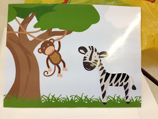
Mock up
Here is the improved mock up for my Jungle themed card, this also now includes a front cover design.
The textures that I have suggested using for this card are,


The textures that I have suggested using for this card are,
- Fuzzy
- Fluffy
- Smooth
- Squishy
These textures will be on the monkey's belly, the giraffe's spots, the lions mane (inside and on front cover) and also on the zebra's stripes.


Wednesday, 6 February 2013
Pitch Feedback
After showing the class my work I am even more confident that this project is going well. I only received good feedback and have been told to continue on as normal.
I have decided that it would be better to follow the path of farmyard, space and underwater rather than my originally thought out princess, pirate and teddy bear picnic.
I have changed my mine about my themes as I feel the new ones will fit the style from the original card design better and they are much more uni sex, there is no need to do girl and boy cards separately as it limits the audience for each card. For this reason I am going to make sure my cards are all suitable for both sexes.
Friday, 1 February 2013
Jungle Mock Up
Now that I have looked into texture and structure, I am taking my jungle themed image and turning it into a sample to show the class how my structure comes together to create a picture.


Here is my jungle design that I have drawn up using Illustrator.

From this I then made a smaller image to test my structure for my sample, I then printed this onto matt photo paper and covered it in sticky back plastic, I then cut out the sections I wanted to be textured such as the zebra's stripes and the belly on the monkey, I then stuck the filler material onto the base card and stuck my image over the top. I am extremely pleased with how this has come out and it has really motivated me to create the other designs for the range of cards.
Here are the two samples, one of which has had text added with my mirror material behind it to make it very shiny.


Saturday, 26 January 2013
Card Structure
The structure of these cards has been a large part of the design process, I have been looking at how touchy feely books are layered and bound to give me an idea of how I will need to structure mine.
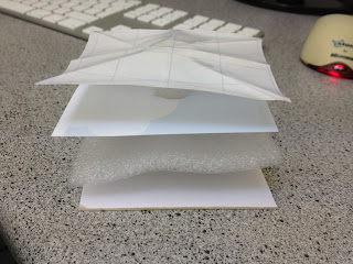
This is a structural sculpture of how my cards are going to be built up, here you can see that at the base of the card, is a thick piece of card which provides the stable shape and the durability needed to stop the cards bending or tearing. Above this is the texture layer, this is the section where all of my different textures and materials will be, above this there is the photo layer, this will hold my design, the sections that will be textured will be cut out of this layer so you can feel through but not reach the edge of the material underneath to prevent the card being pulled apart. The top and final layer in this build is the sticky back plastic, this gives my card a protective layer which also provides the wipeable surface, the sections that are textured will also be cut out from this layer so you can feel through past it.
This structure gives my card the strength and finish it will need.
The next thing I experimented with is the way the spine of the card will work, what I have done is stick a slightly longer than the length of the card layer over the back of the card while it was folded, this gave me the chance to fold this around the depth of the card, effectively creating a spine like a book. this was then stuck down but not all the way to the edge so that when the card is opened the backing can move away from the card letting it open and close with ease. Here is my sample spine card.

Now that I am happy with the structure and spine of the cards I can continue to develop my designs. I have decided that to give myself the best possible area for my scene inside the cards I will make my cards 7in x 7in making them 7in x 14in when opened, this also keeps me in the large letter size which will keep the cost of postage down. This size is perfect for my cards as I do not want them to be too big for the child receiving them to play with.
Thursday, 24 January 2013
Textures
Te next step in my project is to have a look at some textures to give me an idea of which materials accompany words such as bumpy and fuzzy. Here is the moodboard I created using different words and materials.


Sunday, 20 January 2013
Postage
An important part of the card industry is posting. Here I have got a chart of postage sizes, prices and weights.


So here you can see here the depth of a standard letter is very small and will not be deep enough for the layers I will be using in my cards. For this reason I will need my cards to be a large letter which means that I can use up to 353mm x 250mm in width and height. This gives me more room for my designs than originally thought which is a bonus.
Child safe
After looking at children's books that have the same style as the cards I am planning on designing, I have seen a few things that I will need to take into consideration to make sure the cards are suitable to give to young children I will also need to take a few fundamental rules of card design, these together have given we a list of must be's:
- Durable- these cards will be given to children meaning there is a high chance that they will be pulled, pushed and chewed. These cards will need to be able to stay together to prevent any harm to the child.
- Wipeable- These cards might end up will dribble, food or much worse on them, for this reason they will need to have a wipeable surface so that they can stay clean.
- No sharp or pointed corners- As these cards will go to children, they need to be safe and not cause any harm to the child if left unsupervised.
- No tearable or easily perishable materials- No materials that can be pulled off or apart should be used as they can become a choking hazard to the child.
- Writable- Being a card there needs to be a section to write in, there would be no point in sending it otherwise
- Light weight- This is to keep postage price down and also so that if dropped the child will not be hurt by the weight of the cards.
- Interesting- The point of the cards is to stimulate the child, for this reason they need to have an interesting pattern and textures inside, the card also needs to appeal to the buyer so appearance is everything.
Wednesday, 16 January 2013
Class Feedback
After showing the class my three ideas we decided that the child safe touchy feely cards were the best of the three as they are original and leave room for the most creativity.
The next steps in this project will be looking into what makes a card child safe, what size the cards will be and what types of materials can be used.
The next steps in this project will be looking into what makes a card child safe, what size the cards will be and what types of materials can be used.
Monday, 14 January 2013
Initial Ideas
I have come up with three main ideas to pitch to the class, here are the three ideas that I have drawn quick digital sketches of.


My first idea is to have a flap up card, this would be like the old children's books with the lift up flaps that reveal sections that are otherwise hidden, this could be combined with the idea of hide and seek so you have to find the pirates treasure or find all the party quests in the card. This would mainly be given to 5 year olds, and as the UK average pregnancy age is 29, this means that the parents of the 5 year olds would be around 34 which is the top end of my given target audience for the buyer, however this card could also be spent by family and friends that could fall in my target audience of 16-34.
Here is a quick digital sketch of what this idea could look like.

My next idea is to have a pop out of the ox card. This idea would have a small box with a spring inside that is attached to a note from the sender, the idea is that when the box is opened the note will spring out like a jack in the box. This card is a fun idea which will make the recipient laugh and will make the card very memorable. The only problem with this idea is that sending a box instead of a card is going to be more money and the recipient might have to pick it up from the post office is they are out when it arrives. However here is an example of what this idea could look like.

My final idea is to have touchy feely cards, these were inspired by the printed textures on some of the cards that I analysed earlier. On these cards they had strong textures that were printed on to make the cards look more 3d and interesting. I then decided that it would be a good idea to explore this further with using actual textures. This then lead me to think about the "that's not my" book series which is very popular with young children aged around 1. These books have bright pictures and lots of textures to entertain and stimulate children. After looking around I have found that there are no other cards that currently do this to the extreme that they would be able to be doubled up as a you. For this reason I have drawn up a baby safe touchy feely card.


Sunday, 13 January 2013
Existing Cards
After having chosen my brief, I decided to have a look at the sort of cards that are already out there to try and work out what sells and what hasn't been done yet. here are some cards that I found and have analysed.


This is a birthday card by a company called Cinnamon Aitch (http://www.cinnamonaitch.co.uk/) this company has a lot of their cards in paperchase. This card as you can see is very clearly targeted at women as they are the main buyers of cards. This card used more than one layer to keep the card interesting, it uses things such as buttons and googley eyes. This card also has some fake textures on it such as printed knit pattern and a wooden pattern to give the look of real textures. This card has a very cute easy which is making it very appealing. The idea of having a textured look with 3d elements such as buttons is a big selling point and is something that I will consider when creating my cards.

This is another birthday card this time from Hallmark (http://www.hallmark.co.uk/) and this one is targeting a male recipient, and in this can someone's husband. As you ca see this card is very simple and clean as most male targeted cards are however it still appeals to the female audience as they are the ones most likely to be buying the card. There are big differences in male and female cards mainly being that male cards tend to be simple with no 3d trinkets and add ons. This is something to note when designing my card range.

Companies such as funkypigeon.com (http://www.funkypigeon.com/) are becoming popular with their highly personalised cards, and gifts to follow. Unfortunately making card to sell in a shop easily personalised is very tricky but is definitely something to keep in mind when I create my own range.
Thursday, 10 January 2013
Card Stats
To find out more about the card business, I looked into the sales statistics for 2012 and found that the industry for greetings cards, even though it has decreased slightly, is still at a huge 952 million cards sent per year. That averages at 31 cards sent per person per year.
Here are some more interesting facts that I found:
Here are some more interesting facts that I found:
- Nearly 1.38 billion pounds were spent in the uk on greetings cards
- The average retail price (ARP) of a card is now £1.44, up from £1.39.
- Mother’s Day remains the largest Spring Seasons card sending event, showing a rise to £57.2m in 2011 from £56.4m in 2010
- And the UK public continues to show its romantic side with Valentine's Day sales also increasing to £41.5m in 2011, up from £40.7m in 2010
- The UK card industry is acknowledged to be ten years ahead of the rest of the world in terms of design.
- Greeting cards are stocked in more types of outlet than any other product – with one in six retailers stocking greeting cards
All found at:
http://www.greetingcardassociation.org.uk/info-resource/market-info/facts-and-figures
Chosen Brief
After having looked closer at the brief and then having a clas brainstorm about what types of cards are possible I have decided to go with the card making brief. I enjoy using Illustrator and Photoshop and I feel that these skills are best suited for this brief. I also think that I will be able to explore this brief further than the one for baccardi as it is a lot more open and creative.
My next step is to look into some card statistics and have a look at existing cards by this company to get a feel for their branding.
My next step is to look into some card statistics and have a look at existing cards by this company to get a feel for their branding.
Wednesday, 9 January 2013
Class Brainstorm
In todays lesson we looked closer at the briefs we had shortlisted and tried to make a decision on which one we are most likely going to peruse We then got the class together to start generating ideas for a few of the briefs from the YCN's website. One of the ones that was most successful was the UK Greetings cards, which is the one that I feel I am most likely going to take forward in this project.
Here are some of the ideas that we came up with as a class, and although some seem a little bizar and impossible to make, they are all worth noting down as an aspect of concept of one of them might spark an idea.
Using the phrase "stand out from the competition" there are the ideas and suggestions that were made.
Video card
Snow globe card
recycled or recyclable card
Magnetic front card
Fridge magnet card
White or black board front card
Edible card
Scratch and sniff card
Touch and texture card
First holy communism card made of bread
Squirts you in the face card
18th birthday with sick bag inside
Knit or sew your own card
3D card
Puzzle front card
Card with games inside
Light up card
Glow in the dark card
Tuesday, 8 January 2013
Competition Brief
Although we have not been given our full brief yet, we have been told as much as we need to get started on the project. This new project involves the competition put on by the YCN. Each year they put on a competition made up of several different briefs. This year there are 21 companies that have set briefs, some having written more than one. This means that there is a huge variety of choice but does also mean that I will need to go through them all making sure I pick one that is going to give me the best chance of using my skills.
We went through and skimmed the requirements of each brief and marked them out of ten, this was to give ourselves an indication of which ones we need to read in full and start thinking of ideas for.
These are the marks I gave the briefs in relation to how interesting and inspiring I found them to be.
After doing this I looked at my top four briefs in full (Bacardi, Douwe Egberts, Ugg and UK Greetings). From these four I then marked it down the the two I thought I could do the most with, and have taken notes on the two briefs below.
Bacardi
Bacardi are asking us to make themselves appeal more the men, introduce their history to show that Bacardi is not a cheaply made drink. To do this they have suggested new glass wear augmented reality coasters and possibly a new cocktail with a masculine campaign. The whole idea of the campaign is to get guys drinking Bacardi.
The target audience for this brief are males aged around 21, they need to be old enough to drink but young enough to be influential on others in the bar.
The campaign will not be strictly held to bars or clubs, so shouldn't be tied down to this, it will also be shown across different platforms which should be taken into consideration. Because of the nature of the product there are strict advertising standards that must be met throughout the whole campaign.
UK Greetings
UK Greetings are asking for us to create at least four cards and a sub brand name and logo. The cards must include a front cover design, textures and feels, colour choices on both card and envelope, font type and size for inside and outside of card. The size and shape of the card should also be considered.
They have stated that the target audience is around 16-34 and can be for any occasion, they have said that it is mainly women who buy cards and although the cards need to appeal to the recipient, it is the sender who is buying the card and it needs to appeal to them as well.
The main point of them doing this is to make sure that their company keeps giving new designs and ideas to make sure that they stay ahead of the competition, to do this our designs need to be unique and edgy.
Subscribe to:
Comments (Atom)