Monday 30 January 2012

Chosen minute

After reading over the speech I have decided I would like to end my video with the most famous quote "Ask not what your country can do for you, ask what you can do for your country". The brief stated that my video has to be between 55-65 seconds long, so what I did was start from the ask not quote and work backwards for one minute, at 58 seconds back, JFK starts a new paragraph of his speech so I decided that would be my starting point. The minute of speech I will be using is:


"In the long history of the world, only a few generations have been granted the role of defending freedom in its hour of maximum danger. I do not shrink from this responsibility-I welcome it. I do not believe that any of us would exchange places with any other people or any other generation. The energy, the faith, the devotion which we bring to this endeavor will light our country and all who serve it-and the glow from that fire can truly light the world. And so, my fellow Americans: ask not what your country can do for you-ask what you can do for your country."


Below you can see this part of the speech with the words that I thought were the most important highlighted.

Sunday 29 January 2012

JFK

I have decided to use the JFK speech for this project as I feel although it is less emotive than the speech by Earl Spencer, it is a lot more powerful and could make for a stronger film. Although I have listened to the speech and have gone through each word I feel there is a lot of background information I am missing, because of this I have decided to look further into the meaning of the speech and what else happened in 1961.

John Fitzgerald Kennedy was the 35th President of the United States and in 1961 he delivered his Inaugural Address to America. His words were strong and to this day are still well known, his speech was all about keeping America strong, not giving into fear and above all else keeping the country united and peaceful. He wanted to remind people that the country should work together and not be at war with itself or at war at all.

He wanted his speech to asure America that they had made the right choice, he promised so much but his speech successfully reassured the country that he would do his best to achieve everything he had previously said. He was also making sure that America saw him as a bold and strong leader, using lines such as "I do not shrink from this responsibility, I welcome it" built the confidence of his followers and gained him credit from the whole country. Kennedy made his speech personal to the listeners and by addressing them and saying they have the power to change things. Kennedy's speech gave the common citizen a right and a role and at the start of the speech he addresses them putting them on the same level as the government. Overall the speech was hugely successful with a combination of strength, determination and respect for the everyday person, Kennedy definitely gained confidence from his country.


1961

The main news in 1961
(http://www.downthelane.net/growing-up-50s-60s/1961-news-entertainment.php)

  • Sunday Telegraph first published 
  • John F. Kennedy becomes the 35th President of the United States. 
  • The Beatles perform at the Cavern Club in Liverpool for the first time. 
  • The first U.S. Polaris submarines arrive at Holy Loch. 
  • Soviet cosmonaut Yuri Gagarin becomes the first human in space 
  • The government unveils new "panda" crossings with push button controls for pedestrians 
  • Michael Ramsey enthroned as the 100th Archbishop of Canterbury 
  • Russian ballet dancer Rudolf Nureyev requests asylum in France while in Paris 
  • Tottenham Hotspur become the first English football team this century to win both the League title and FA Cup. 
  • Construction of the Berlin Wall begins 
  • Betting shops are legalised. 
  • George Blake is sentenced to 42 years imprisonment for spying 
  • Police arrest over 1,300 protesters in Trafalgar Square during a CND rally 
  • The Vietnam War officially begins, as the first American helicopters arrive in Saigon 

Here is an image I found on the internet summing up what happened in 1961, it includes prices, events, music, movies and people that were born in 1961.


Thursday 26 January 2012

The speeches

After having listened to the speeches I have decided that the two I like the best are John F Kennedy: Ask not what your country can do for you and Earl Spencer: The most hunted person of the modern age. I feel that Earl Spencer's speech is very emotive and powerful however the pace of the speech is a little slow so may be hard to keep it interesting. 
The JFK speech is very strong and powerful and the pace is a lot faster which will be easier to edit to, however, I am less familiar with what the speech is about so will need to do more research into it before I can fully decide.


The first thing I did to get a better look at the speeches was to highlight the words in the speeches that I thought were the most important. This helped me to understand the speech and see the order of which it is spoken. Below you can see JFK's speech with the highlighted words.


JFK: Ask not what your country can do for you


After this I then entered the speeches into www.wordle.com which is a site that takes to words and makes them into a cloud, in this the words that are used most frequently appear bigger than the words that are only used once or twice. 
This is a great way to see what the most important words are and can give you a really good idea of what the speech is about an who it is aimed at. Below you can see these clouds for both of the speeches.


JFK: Ask not what your country can do for you


Earl Spencer: The most hunted person of the modern age

Wednesday 25 January 2012

Brief

For this project we have been asked to create a TV trailer for a series of radio programmes on Radio 4 called ‘Speeches’. 
The speeches we have been given are:


  • Franklin D Roosevelt:  The only thing we have to fear is fear itself
  • Winston Churchill:  We shall fight them on the beaches
  • Harold Macmillan: The wind of change
  • Nelson Mandela: An ideal for which I’m prepared to die
  • Jawahharal Nahru: A tryst with destiny
  • John F Kennedy: Ask not what your country can do for you
  • Martin Luther King: I have a dream
  • Margaret Thatcher: The lady’s not for turning
  • Earl Spencer: The most hunted person of the modern age


The brief states that "The TV trailers will act as ‘teasers’ about the speeches by creating short films which use a combination of an excerpt of the speech accompanied by atmospheric, original footage and text graphics.  These films need to be 1 minute long (with a 5 second leeway in each direction)."
So I will need to concentrate on timing so that I don't go over or under the 55-65 second barrier. 


The brief also states that "You are not searching for original footage of the speech being delivered, and nor are you trying to film literal interpretations of what is being said, but rather you will devise, shoot edit and post produce a sequence of shots which add visual accompaniment to the words being spoken. This film will also feature text elements which are used to highlight words being spoken in the speech.  You can also use music and/or sound effects in your film."
This is where I feel I am going to struggle with this project as I have not yet had to make something without a general theme or concept and coming up with one that can not be literal is going to be a challenge. However, I am looking forward to trying this and seeing where this extremely open brief takes me. 

Friday 20 January 2012

Evaluation

Looking back over this project I feel I have made some very good decisions, when I pitched my first set of ideas to the class there wasn't a huge amount of excitement around the ideas I had come up with, I am very glad that I didn't just do them anyway because the ideas I came up with after those were much much stronger and I received much better feedback from them. 
I am very happy that I came across Martin O'neill in this project, he has been a huge influence in my work and will continue to be my inspiration for other projects to come.   
Looking at how my work has come out the I am over the moon, I am so pleased with the look of my work and could happily put this down to being one of my most successful projects to date.
If I were to do this project I wouldn't change a thing, however I possibly would have left myself more time for printing as it would have been nice to have my prints at A2 instead of A3 and there was a problem when printing one of my pieces, when I exported it from Photoshop it put a white line over my black logo, I then gave the print shop the Photoshop version of the image but for some reason the lines have come out pixelated, if I had given myself more time I would have tried again to get perfect quality. 
The images themselves I am extremely happy with and I even impressed myself with how well I got on with In Design. 

Here you can see all of my final images including a few pictures of them in situ, in bus stations and on the underground advertising space.


Final images and printing

Now that I have made all of my changes I am ready to print my images, below are all of my finished posters and the inside and outside of my leaflet. 


My posters will be printed to A3 size and my leaflet will be printed onto an A4 sheet to be the right size, all of this will be done in The Print Room, Lewes. 

Changes made

After my crit there were a few things I could look at changing. The first being the explaining line of text on my posters. After coming up with some ideas and asking the class which were the best I have decided on 


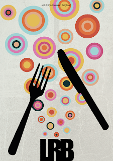
eat @ london road brighton
drink @ london road brighton
shop @ london road brighton


These very quick easy slogans will just confirm what the poster is about and make the reader want to find out more.


On my eat poster I have made the knife and fork smaller and thinner and got rid of the spoon making the poster look much better below you can see a before and after.


For my drink poster I have tried to make the logo black however after doing so and showing it to the class they agreed that my original idea looks better so I have stuck with that, here you can see what the change looked like followed by what I am going to stick with.


The changes I have made to my leaflet are that I have added my own content, made the words bigger and made the graphics slightly larger although I found that after having made the text bigger the graphics didn't need to be much larger. Here you can see a before and after of my leaflet.


Crit

As part of the project I have put my work together to show the class how it is going to look to get feedback and suggestions on what to change. Here are my posters and my leaflet that I have shown the class.


Starting with my leaflet the overall feedback was very good, the changes people suggested were to add proper content rather than holding text, make the text bigger and use less of it as it is rather wordy and also to make the graphics inside bigger.


Next I asked for feedback on my posters, I have shown all three poster together as well as some of the posters in situ, using an image from London underground and a Brighton bus stop. The feedback from my posters was extremely positive. Everyone liked the look and feel of the posters. For my food based poster people suggested that maybe the knife and fork were too big and the spoon could be taken away to make the targets a little more important, on my drinks based poster people suggested I take part of the bottle off and make the logo black. The only other thing that was mentioned is that I have a small line of text which is going to explain the posters which is currently holding text, the suggestion was that I decide exactly what I am planning on putting there. 
I am very happy with how my crit went and I feel that the feedback is vey useful and will improve my work.

Making my leaflet

The first thing I did to create my leaflet was to open a new document in In Design. The following box came up and I made sure that I had two pages with 4 columns, a very small gutter and no margins.


I then added my images that I had made in Illustrator and Photoshop for the leaflet, I saved these out as PNG files and file/placed the images where I wanted them. After this I added text boxes using the Text tool and placed them where I thought appropriate. I then filled the boxes with holding text to see how it would look. 


Leaflet Design

After having finished my three poster, I wanted my leaflet to reflect parts of them that will be easily recognisable, for example, the triangles and the targets. I have already decided that I am going to have my first poster as my front cover to my leaflet as well, and earlier in the project I decided that I like the gatefold leaflets the best. Here I have done two design ideas for the inside of my leaflet.


Here is my first idea, in this idea I have my logo in the centre of the inside pages, the top left hand corner shows a selection of my targets coming in around the shape of the corner and this is mirrored by the triangles doing the same in the bottom right hand corner. I like this design, it feels very well balanced and leave plenty of room for text.


This is my second design, for this the logo stays at the bottom centre of the inside pages, the targets and triangles are scattered around the inside pages. This is a good design as it brings colour to the whole leaflet however there is no order and this may cause a problem with where to place the text. For these reasons I have decided to stick with my first idea.

Making the third poster

My third poster also started in Illustrator. The first thing I did was to create targets going up the page in a similar way to the circles. To do this I drew a circle using the ellipse tool. I then drew a smaller circle inside that and another to make it look like a target. I copied this technique making the targets bigger as I went up the page. I also added the logo at the bottom making it exactly the same as before. 


The next thing I did was added colour, to do this I used exactly the same colour pallet as I did in my second poster. Using the black arrow tool I selected parts of the targets and gave them whatever colour fill I decided looked right. 


After seeing this in a full mock up I decided the dark stroke lines look a little strange so I highlighted all of the targets and gave them no fill which looked a lot better.


The next thing I needed to do was to add the cutlery. To do this I drew around a knife fork and spoon using the pen tool. I gave each of these a solid black fill and added them onto the poster. I tried many different positions on the page as I wasn't happy with the positioning in my mock up. The position I was most pleased with was the one below. 


After this I then exported it as a PNG and dropped it into Photoshop. I added the same textured background as the other two posters have to give me my full poster.


Making the second poster

For my second poster I started in Illustrator. The first thing I did was draw a bottle using the pen tool and gave it a fill of solid black. I then dropped in Martin O'neill's image of the tree and triangles and using the pen tool again I drew around the triangles to get the basic shape, I then added my own triangles to make the shape fit around the bottle instead of the tree. 


After this I then added colour to the triangles. To make sure I got the right colours I used the eyedropper tool on the original image to pick out the best colours. Adding them to my swatches pallet meant I could use them all without having to find them again. All I did after this was to select particular triangles and made both the fill and stroke the colour I wanted it.


Once I was happy with how it looked I exported it as a PNG and opened it in Photoshop. At first I added a brown strip at the bottom of the page but after seeing this I decided it didn't work. So what I did was to use this PNG and place it over the same textured background as the first poster. I also needed to have the logo on the bottle, because I had added the textured background it looked strange to have the logo in white. So in Illustrator I added the logo to the bottom of the bottle and cut it out so that when the new PNG was over the texture in Photoshop it looked like this.

Thursday 19 January 2012

Making the first poster

The first thing I did for this poster was to create the circles. To do this I used the Elliptical Marquee tool and the paint bucket. Once I had added all the circles in the colours I wanted I added a multiply effect to the layer and dropped their opacity to make them overlap one another. 


The next thing I did was to create my logo at the bottom of the page. I wanted a bold, simple font that was close together so it looked almost like one block. To do this I added a text box and wrote "LRB" in impact, I then changed the spacing between the letters so that it was -100. 


This then went at the bottom of the image to make it look like this is where the circles are coming from. I then added a background texture from an image I found and dropped it opacity so it was quite subtle and I then added a base color onto the background layer. To finish it off I then added the letters to spell out regeneration in different fonts and ended up with this.


After looking at this put together I decided it needed more and a suggestion that was made was to have an image or drawing in the background. I thought that would be a good idea so opened an image of a well built up street into Illustrator. In Illustrator I then used the pen tool to draw around the image to create a line drawing.


I then exported that as a PNG and opened it in Photoshop. I then dropped it behind my logo and circle layers to see how i would look. I was very pleased with the over all look of the image and have decided that it will work well as both a poster and a Leaflet cover. I may however take off the word regeneration for the poster image as I feel it may be too much for someone passing by to take in. 


Mock Ups

Once I had finished my sketches I decided to mock them up again to get a clear idea of what they might look like. To do this I used a combination of Photoshop and Illustrator. My first idea was to have the letters "LRB" at the bottom of the image and circles bubbling up from around it. I then wanted to have the word "regeneration" scattered in different fonts. Sticking to this idea I created this mock up.


Here you can see that ontop of my original design I have also added a background texture as this is something Martin O'neill does in all of his images. I like how this is looking but feel that its a little bare. One person in my class suggested having an image of some sort in the background, so I thought I would give it a go and see how it look. I then found an image of a well developed street and created a line drawing from it in Illustrator and then added this into the background of the image above.


Now I have seen what this looks like with an image in the background I am very pleased with this design and feel this could work for both my leaflet cover and a poster.


The second idea I had was to use Martin O'neill's image of the tree and triangles and create the same effect around a wine bottle to represent the bars opening up down London Road. To do this I drew an image of a wine bottle and all of the triangles in Illustrator and then placed that into photoshop, added a white logo to show up on the bottle and the brown strip at the bottom like the original.


I am over the moon with how the bottle and the triangles are looking, I feel the colours work particularly well as I took samples from the original image to get them right. The brown strip at the bottom of this image doesn't work for me. Even though the original had this I think this idea will benefit from getting rid of the brown and bringing in the same textured background as the image before. I think with these changes this idea could become very strong.


My final idea was similar to my first in its layout but used cutlery to represent the restaurants that are coming to London Road. I drew all of this piece in Illustrator but now I have seen how it looks I will be dropping it into Photoshop to add the same textured background as the first, not only will this make the image more interesting but it will also keep a running theme between my work. I would also like to get rid of the black outline on the targets and rearrange the cutlery so they dont interfere with the targets as much. With some of these changes I feel this is another strong piece and I am very happy to continue my work from here.